Plotting with ggplot - the plotnine package#
ggplot is a system for declaratively creating graphics, based on The Grammar of Graphics. You provide the data, tell ggplot how to map variables to aesthetics, what graphical primitives to use, and it takes care of the details.
To use ggplot in python you first have to install the plotnine package.
Installing plotnine#
! python -m pip install plotnine
Requirement already satisfied: plotnine in /home/grosedj/python-envs/M550/env/lib/python3.9/site-packages (0.8.0)
Requirement already satisfied: patsy>=0.5.1 in /home/grosedj/python-envs/M550/env/lib/python3.9/site-packages (from plotnine) (0.5.2)
Requirement already satisfied: mizani>=0.7.3 in /home/grosedj/python-envs/M550/env/lib/python3.9/site-packages (from plotnine) (0.7.3)
Requirement already satisfied: statsmodels>=0.12.1 in /home/grosedj/python-envs/M550/env/lib/python3.9/site-packages (from plotnine) (0.13.0)
Requirement already satisfied: numpy>=1.19.0 in /home/grosedj/python-envs/M550/env/lib/python3.9/site-packages (from plotnine) (1.21.3)
Requirement already satisfied: matplotlib>=3.1.1 in /home/grosedj/python-envs/M550/env/lib/python3.9/site-packages (from plotnine) (3.4.3)
Requirement already satisfied: descartes>=1.1.0 in /home/grosedj/python-envs/M550/env/lib/python3.9/site-packages (from plotnine) (1.1.0)
Requirement already satisfied: pandas>=1.1.0 in /home/grosedj/python-envs/M550/env/lib/python3.9/site-packages (from plotnine) (1.3.4)
Requirement already satisfied: scipy>=1.5.0 in /home/grosedj/python-envs/M550/env/lib/python3.9/site-packages (from plotnine) (1.7.1)
Requirement already satisfied: six in /home/grosedj/python-envs/M550/env/lib/python3.9/site-packages (from patsy>=0.5.1->plotnine) (1.16.0)
Requirement already satisfied: palettable in /home/grosedj/python-envs/M550/env/lib/python3.9/site-packages (from mizani>=0.7.3->plotnine) (3.3.0)
Requirement already satisfied: python-dateutil>=2.7 in /home/grosedj/python-envs/M550/env/lib/python3.9/site-packages (from matplotlib>=3.1.1->plotnine) (2.8.2)
Requirement already satisfied: kiwisolver>=1.0.1 in /home/grosedj/python-envs/M550/env/lib/python3.9/site-packages (from matplotlib>=3.1.1->plotnine) (1.3.2)
Requirement already satisfied: pillow>=6.2.0 in /home/grosedj/python-envs/M550/env/lib/python3.9/site-packages (from matplotlib>=3.1.1->plotnine) (8.4.0)
Requirement already satisfied: cycler>=0.10 in /home/grosedj/python-envs/M550/env/lib/python3.9/site-packages (from matplotlib>=3.1.1->plotnine) (0.10.0)
Requirement already satisfied: pyparsing>=2.2.1 in /home/grosedj/python-envs/M550/env/lib/python3.9/site-packages (from matplotlib>=3.1.1->plotnine) (3.0.1)
Requirement already satisfied: pytz>=2017.3 in /home/grosedj/python-envs/M550/env/lib/python3.9/site-packages (from pandas>=1.1.0->plotnine) (2021.3)
WARNING: You are using pip version 20.2.3; however, version 21.3.1 is available.
You should consider upgrading via the '/home/grosedj/python-envs/M550/env/bin/python -m pip install --upgrade pip' command.
Importing plotnine#
import plotnine
Exercise 1#
Install and import plotnine.
ggplot works very well with pandas data frames. The column headerfs can be used to clearly specify details of the plot.
import pandas as pd
import numpy as np
X = np.arange(0,10,0.01)
Y = np.random.normal(X,0.5)
df = pd.DataFrame({"X" : X,"Y" : Y})
df
| X | Y | |
|---|---|---|
| 0 | 0.00 | -0.243228 |
| 1 | 0.01 | 0.403424 |
| 2 | 0.02 | 0.935285 |
| 3 | 0.03 | 0.175121 |
| 4 | 0.04 | -1.027102 |
| ... | ... | ... |
| 995 | 9.95 | 10.408726 |
| 996 | 9.96 | 9.778239 |
| 997 | 9.97 | 10.466935 |
| 998 | 9.98 | 9.689504 |
| 999 | 9.99 | 10.114815 |
1000 rows × 2 columns
Example 1 - an empty plot#
import the things we need#
from plotnine import ggplot, geom_point, aes, stat_smooth, facet_wrap
create a plot#
p = ggplot(df,aes(x=X,y=Y))
#### have a look
print(p)
All this has done is create a plot with some data and specified an aesthetic using aes. In this case, the aesthetic associates the x axis with the X data and the y axis with the Y data. The plot exists and can be displayed. Notice that the plot is assigned to a variable. This is useful because the plot can now be modified through the variable (many plotting facilities do not support this) and thus allows you to program with plots.
Notice also that to display the plot you can use the print function.
Features are added to the plot using layers. A plot can have many layers.
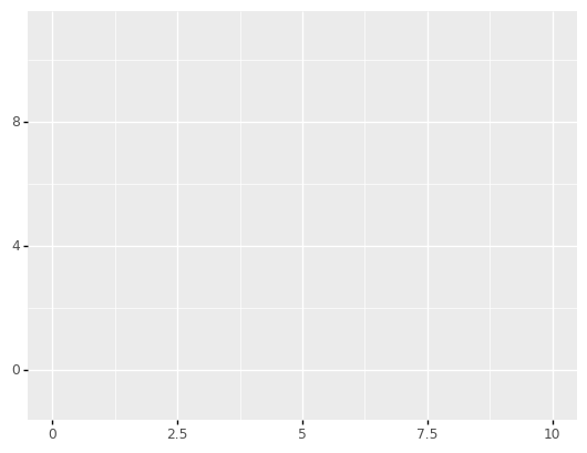
Example 2 - add some points#
p1 = p + geom_point()
print(p1)
Notice how a new plot p1 was created from the original plot p using +.
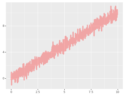
Example 3 - add some lines#
from plotnine import geom_line
p2 = p + geom_line()
print(p2)

Exercise 2#
Create a plot with both points and lines.

Customising appearance#
Each layer can be customised in a way appropriate for that layer.
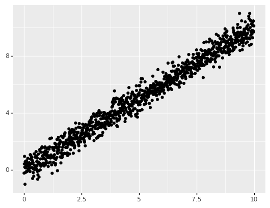
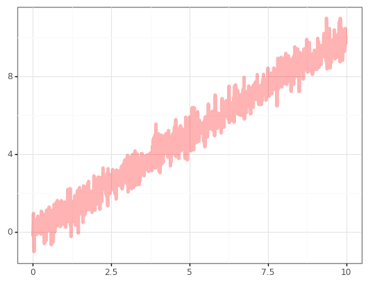
Example 4 - Customise the lines#
p2 = p + geom_line(color="red")
print(p2)
Exercise 3#
Experiment with the following code to change the appearance of the plot. The following is a good source of information.
# p2 = p + geom_line(color="red",size=2,alpha=0.3,linetype=3)
p2 = p + geom_line(color="red",size=2,alpha=0.3,linetype="solid")
print(p2)
Themes#
The “style” of a plot can be modified and controlled through the use of themes.
Example 5 - A black and white theme.#
from plotnine.themes import theme_bw
p2 = p2 + theme_bw()
print(p2)
There are many themes to choose from. You can find out about them here.
Exercise 4#
Experiment with some of the themes documented on the plotnine website
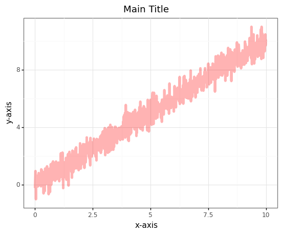
Labels#
It is easy to add labels to a plot
Example 6 - Adding Labels#
from plotnine.labels import labs
p2 = p2 + labs(
    title = "Main Title",
    subtitle = "a subtitle",
    caption = "A caption",
    tag = "A tag",
    x = "x-axis",
    y = "y-axis"
  )
print(p2)
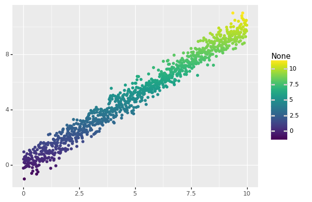
More aesthetics#
It is possible to add aesthetics to a layer. You can think of an aesthetic as a mapping between the data and features of the layer. For example, you can make the colour change with the data.
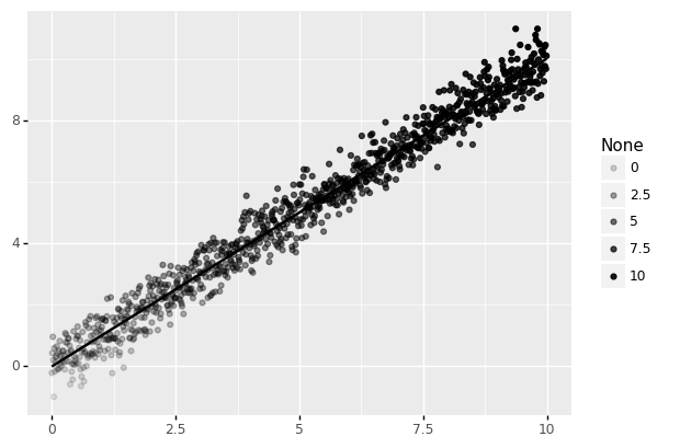
Example 7 - Colour as a function of value#
p3 = p + geom_point(aes(color=Y))
print(p3)
Example 8 - Transparency as a function of value#
p3 = p + geom_point(aes(alpha=Y))
print(p3)

Example 9 - Smoothing the data#
from plotnine import geom_smooth
p3 = p + geom_point(aes(alpha=Y)) + geom_smooth()
print(p3)
Plot types#
There are lots of different plot types. A good way to find out about them is look through the some of the online galleries. A good starting point for a wide range of examples with code and data is the R graph library. I have picked a few and added them as examples.
#### data
xa = np.random.normal(np.ones(20000)*10,1.2)
xb = np.random.normal(np.ones(20000)*14.5,1.2)
xc = np.random.normal(np.ones(20000)*9.5,1.2)
X = np.hstack([xa,xb,xc])
ya = np.random.normal(np.ones(20000)*10,1.2)
yb = np.random.normal(np.ones(20000)*14.5,1.2)
yc = np.random.normal(np.ones(20000)*15.5,1.2)
Y = np.hstack([ya,yb,yc])

df = pd.DataFrame({"X" : X,"Y" : Y})

df
| X | Y | |
|---|---|---|
| 0 | 11.249070 | 10.135695 |
| 1 | 9.667877 | 8.102466 |
| 2 | 11.291468 | 9.986724 |
| 3 | 9.363721 | 10.621342 |
| 4 | 9.639383 | 10.266212 |
| ... | ... | ... |
| 59995 | 9.102634 | 16.842442 |
| 59996 | 9.555181 | 13.630412 |
| 59997 | 8.158613 | 14.854846 |
| 59998 | 7.458265 | 14.704807 |
| 59999 | 10.410255 | 15.411592 |
60000 rows × 2 columns
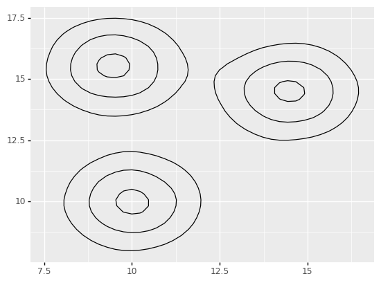
Example 10 - Simple contour plot#
from plotnine import geom_density_2d
p = ggplot(df,aes(x=X,y=Y))
p1 = p + geom_density_2d()
print(p1)
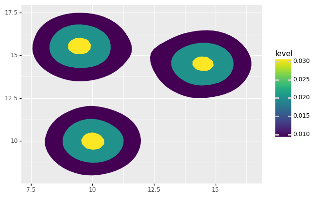
from plotnine import stat_density_2d
#p2 <- p + stat_density_2d(aes(fill='..level..'), geom='polygon')
p2 = p + stat_density_2d(aes(fill='..level..'),geom='polygon')
print(p2)
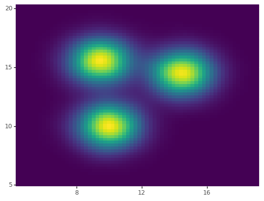
from plotnine import scale_x_continuous,scale_y_continuous
from plotnine.themes.themeable import legend_position
from plotnine.themes import theme
p4 = p + stat_density_2d(aes(fill='..density..'), geom='raster', contour=False)
p4 = p4 + scale_x_continuous(expand = (0, 0))
p4 = p4 + scale_y_continuous(expand = (0, 0))
p4 = p4 +  theme(legend_position='none')
print(p4)
blob = dict()
blob[(1,2,3,4)] = 6