
5. ggplot2#
5.1. Getting started with ggplot2#
ggplot2 is a system for declaratively creating graphics, based on The Grammar of Graphics. You provide the data, tell ggplot2 how to map variables to aesthetics, what graphical primitives to use, and it takes care of the details.
To use ggplot2 you first have to install the package.
5.1.1. Exercise 1#
Use the install.packages function to install ggplot2.
install.packages("ggplot2")
Show code cell output
Installing package into ‘/home/grosed/R-notes-env/R-packages’
(as ‘lib’ is unspecified)
5.1.2. Example 1 - Simple line plot#
# load the package
library(ggplot2)

# generate some data
X<-seq(0,100,1)
Y<-cumsum(rnorm(101))
# ggplot likes data frames
df<-data.frame(X,Y)

# create a plot
p <- ggplot(df,aes(x=X,y=Y))

print(p)

All this has done is create a plot with some data and specified an aesthetic using aes. In this case, the aesthetic associates the x axis with the X data and the y axis with the Y data. The plot exists and can be displayed. Notice that the plot is assigned to a variable. This is useful because the plot can now be modified through the variable (many plotting facilities do not support this) and thus allows you to program with plots.
Notice also that to display the plot you can use the print function.
Features are added to the plot using layers. A plot can have many layers.
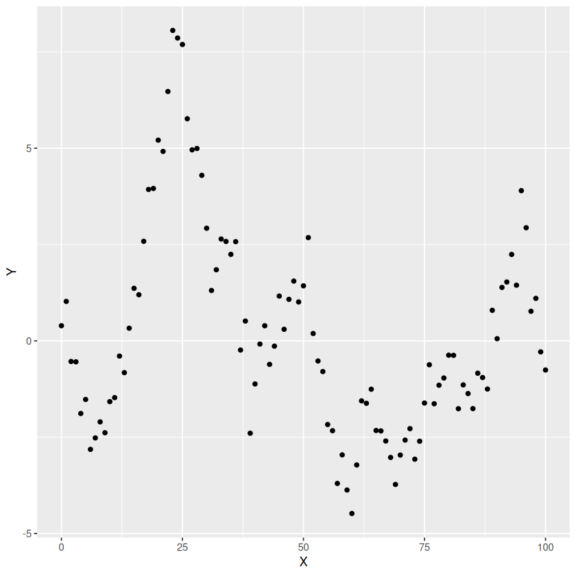
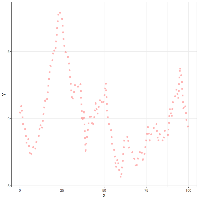
5.1.3. Example 2 - Add some points#
# add a layer
p1 <- p + geom_point()
print(p1)
5.1.4. Example 3 - Add some lines#
p2 <- p + geom_line()
print(p2)

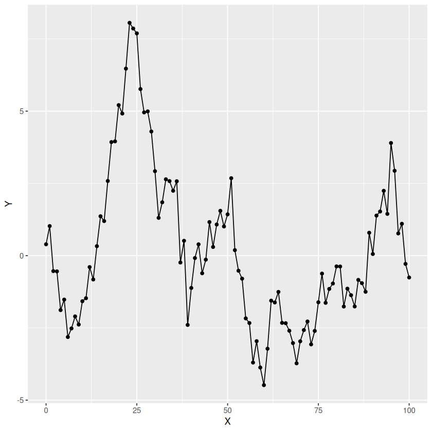
5.1.5. Exercise 2#
Create a plot with both points and lines.
Show code cell source
p3 <- p + geom_line() + geom_point()
print(p3)
Show code cell output
5.2. Customising appearance#
Each layer can be customised in a way appropriate for that layer.
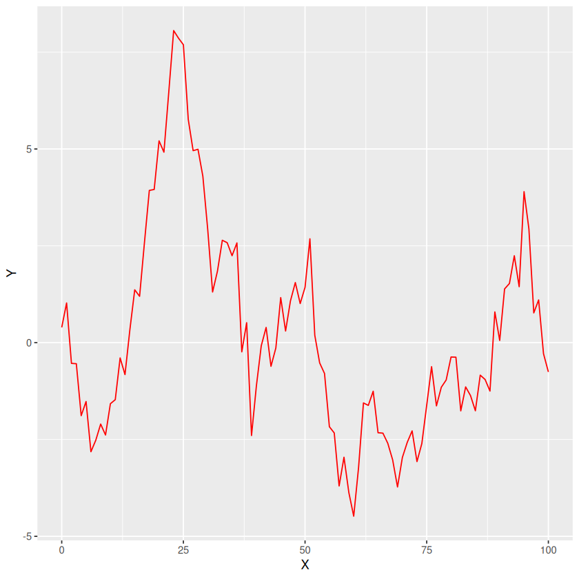
5.2.1. Example 4 - Customise the lines#
p2 <- p + geom_line(color="red")
print(p2)
5.2.2. Exercise 3#
Experiment with the following code to change the appearance of the plot.
p2 <- p + geom_line(color="red",size=2,alpha=0.3,linetype=3)
print(p2)
Warning message:
“Using `size` aesthetic for lines was deprecated in ggplot2 3.4.0.
ℹ Please use `linewidth` instead.”
5.3. Themes#
The “style” of a plot can be modified and controlled through the use of themes.
5.3.1. Example 4 - A black and white theme.#
p2 <- p2 + theme_bw()
print(p2)
There are many themes to choose from. You can find out about them here
5.3.2. Exercise 4#
Experiment with some of the themes documented on the ggplot2 website
5.4. Labels#
It is easy to add labels to a plot
5.4.1. Example 5 - Adding Labels#
p2 <- p2 + labs(
    title = "Main Title",
    subtitle = "a subtitle",
    caption = "A caption",
    tag = "A tag",
    x = "x-axis",
    y = "y-axis"
  )
print(p2)

5.5. More aesthetics#
It is possible to add aesthetics to a layer. You can think of an aesthetic as a mapping between the data and features of the layer. For example, you can make the colour change with the data.
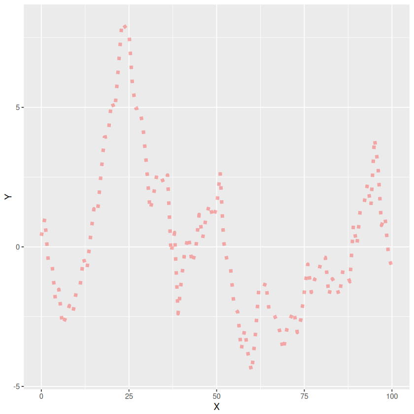
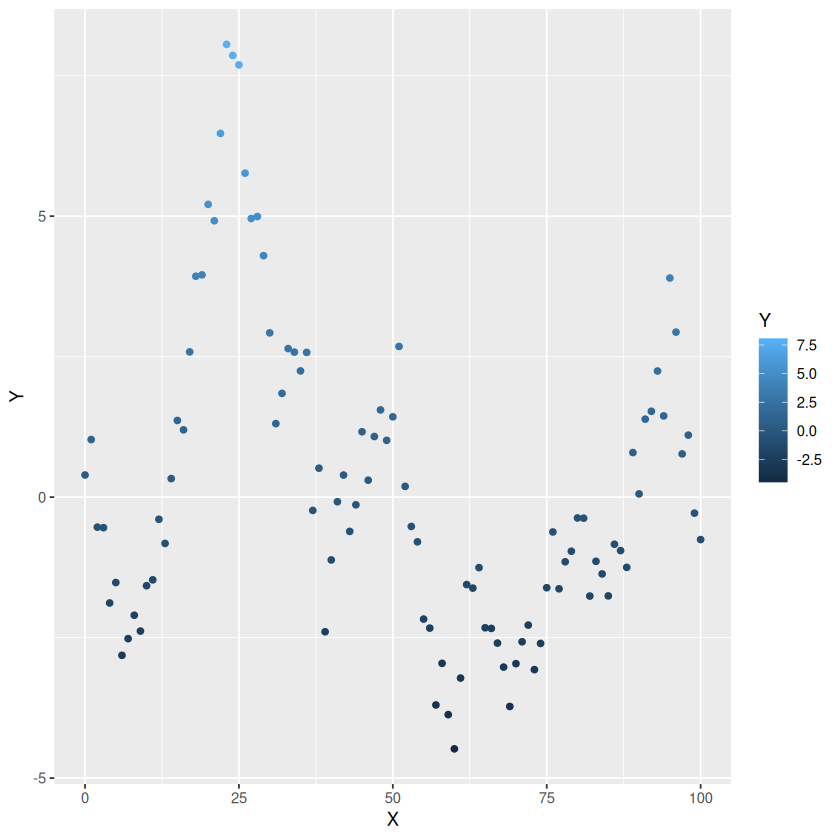
5.5.1. Example 6 - Colour as a function of value#
p3<-p + geom_point(aes(color=Y))
print(p3)
5.5.2. Example 7 - Transparency as a function of value#
p3<-p + geom_point(aes(alpha=Y))
print(p3)

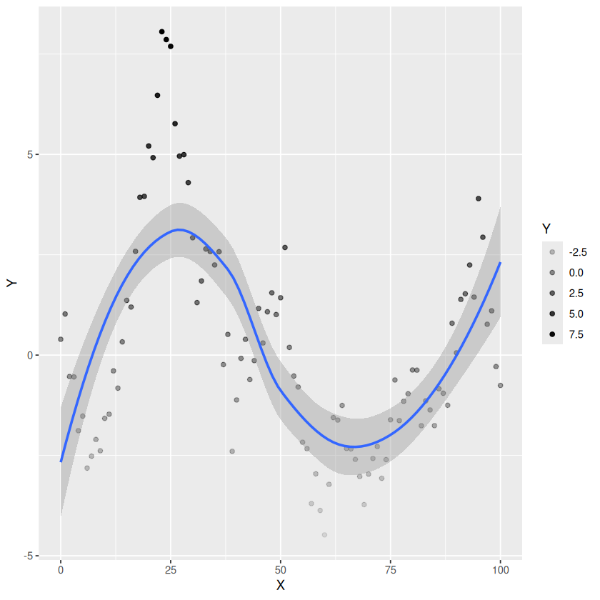
5.5.3. Example 8 - Smoothing the data#
p3<-p + geom_point(aes(alpha=Y)) + geom_smooth()
print(p3)
`geom_smooth()` using method = 'loess' and formula = 'y ~ x'
5.6. Plot types#
There are lots of different plot types. A good way to find out about them is look through the some of the online galleries. A good starting point for a wide range of examples with code and data is the R graph library. I have picked a few and added them as examples.
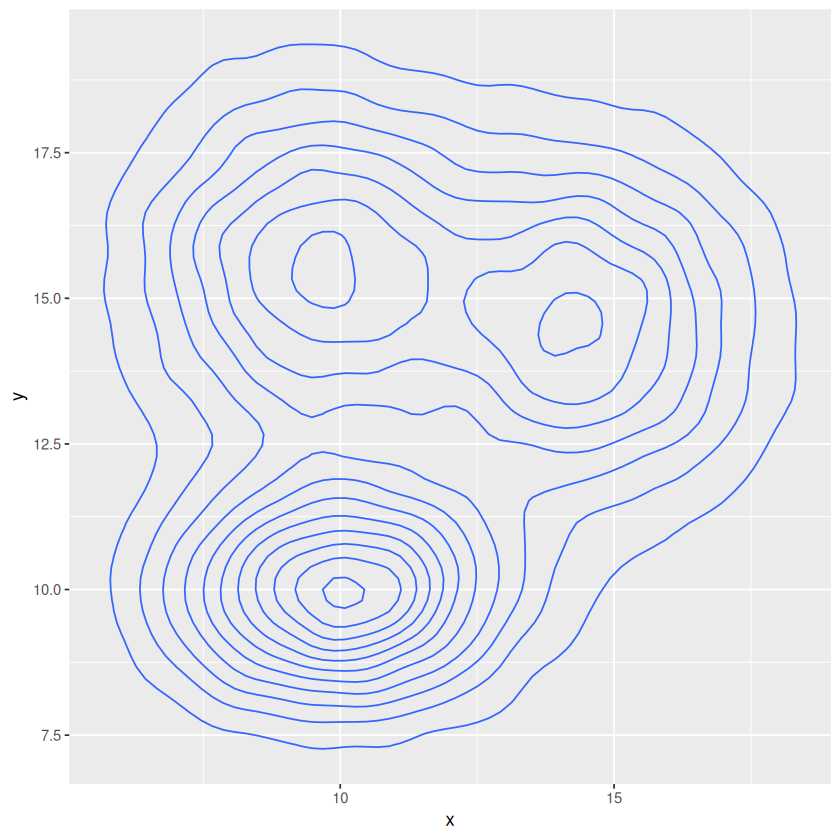
# Data
a <- data.frame( x=rnorm(20000, 10, 1.9), y=rnorm(20000, 10, 1.2) )
b <- data.frame( x=rnorm(20000, 14.5, 1.9), y=rnorm(20000, 14.5, 1.9) )
c <- data.frame( x=rnorm(20000, 9.5, 1.9), y=rnorm(20000, 15.5, 1.9) )
df <- rbind(a,b,c)
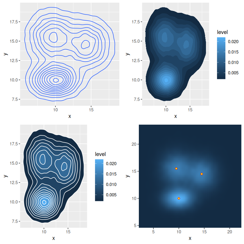
5.6.1. Example 9 - Simple contour plot#
p <- ggplot(df, aes(x=x, y=y) )

p1 <- p + geom_density_2d()
print(p1)
p2 <- p + stat_density_2d(aes(fill = ..level..), geom = "polygon")
print(p2)
Warning message:
“The dot-dot notation (`..level..`) was deprecated in ggplot2 3.4.0.
ℹ Please use `after_stat(level)` instead.”

p3 <- p + stat_density_2d(aes(fill = ..level..), geom = "polygon", colour="white")
print(p3)

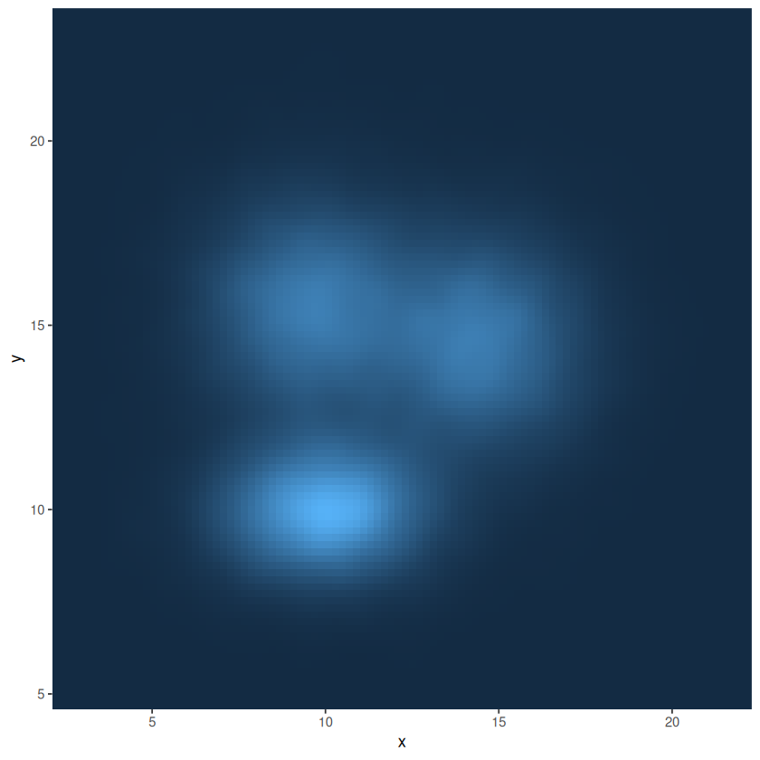
p4 <- p + stat_density_2d(aes(fill = ..density..), geom = "raster", contour = FALSE) +
  scale_x_continuous(expand = c(0, 0)) +
  scale_y_continuous(expand = c(0, 0)) +
  theme(
    legend.position='none'
  )
print(p4)
You can add extra data to a layer.
5.6.2. Example 10 - Adding data to a layer#
hotspots<-data.frame(x=c(10,14.5,9.5),y=c(10,14.5,15.5))
p4 <- p4 + geom_point(data=hotspots,aes(x=x,y=y),shape=23,fill="yellow",color="red")
plot(p4)

5.7. Organising plots#
5.7.1. Exercise 5#
Install the gridExtra package.
Show code cell source
install.packages("gridExtra")
Show code cell output
Installing package into ‘/home/grosed/R-notes-env/R-packages’
(as ‘lib’ is unspecified)
5.7.2. Example 11 - Putting plots together in a grid#
library(gridExtra)
grid.arrange(p1,p2,p3,p4,nrow = 2,ncol=2)
5.7.3. Exercise 6#
Find out mor details about gridExtra here and experiment with some different plot arrangements.
5.8. Saving plots#
5.8.1. Example 12 - Saving a plot to a pdf file.#
p5 <- grid.arrange(p1,p2,p3,p4,nrow = 2,ncol=2)
ggsave("mutiple-countor-plots.pdf",p5)
Saving 6.67 x 6.67 in image
5.8.2. Exercise 13#
Use the help function to find out how to save a plot using a different file format.